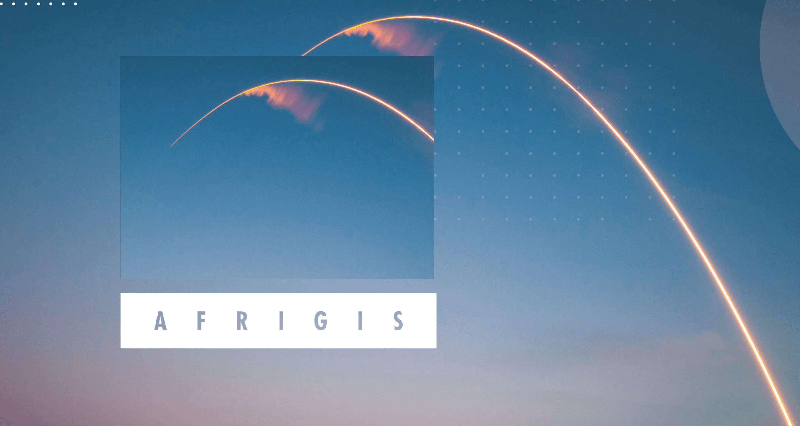
Afrigis Branding
A bold, intelligent brand rooted in curiosity, clarity, and the science of “where is where it starts.”
Brand Design
Website Design
Introduction
AfriGIS is a geospatial information company solving complex location-based challenges through data, design, and innovation. Our role was to distill that layered, scientific depth into a brand that feels focused, empowering, and undeniably human.
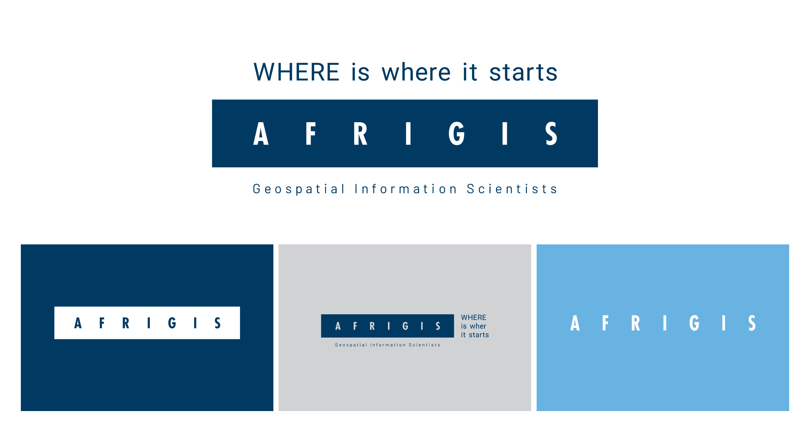
Where Is Where It Starts
Our role was to distill that layered, scientific depth into a brand that feels focused, empowering, and undeniably human. We rebuilt the identity from the ground up, including the tone of voice, design system, illustration style, and marketing touchpoints. Every element had to reflect their core truth: “WHERE is where it starts.”
Credits
Role: Senior Designer
Agency: Limbik
The Problem
Despite offering advanced solutions to some of the continent’s biggest data problems, AfriGIS’s existing identity lacked emotional clarity and consistency.
Their visual language was fragmented. Their voice felt technical and formal, not reflective of their creative, curious, people-driven approach to science and problem-solving.
The Solution
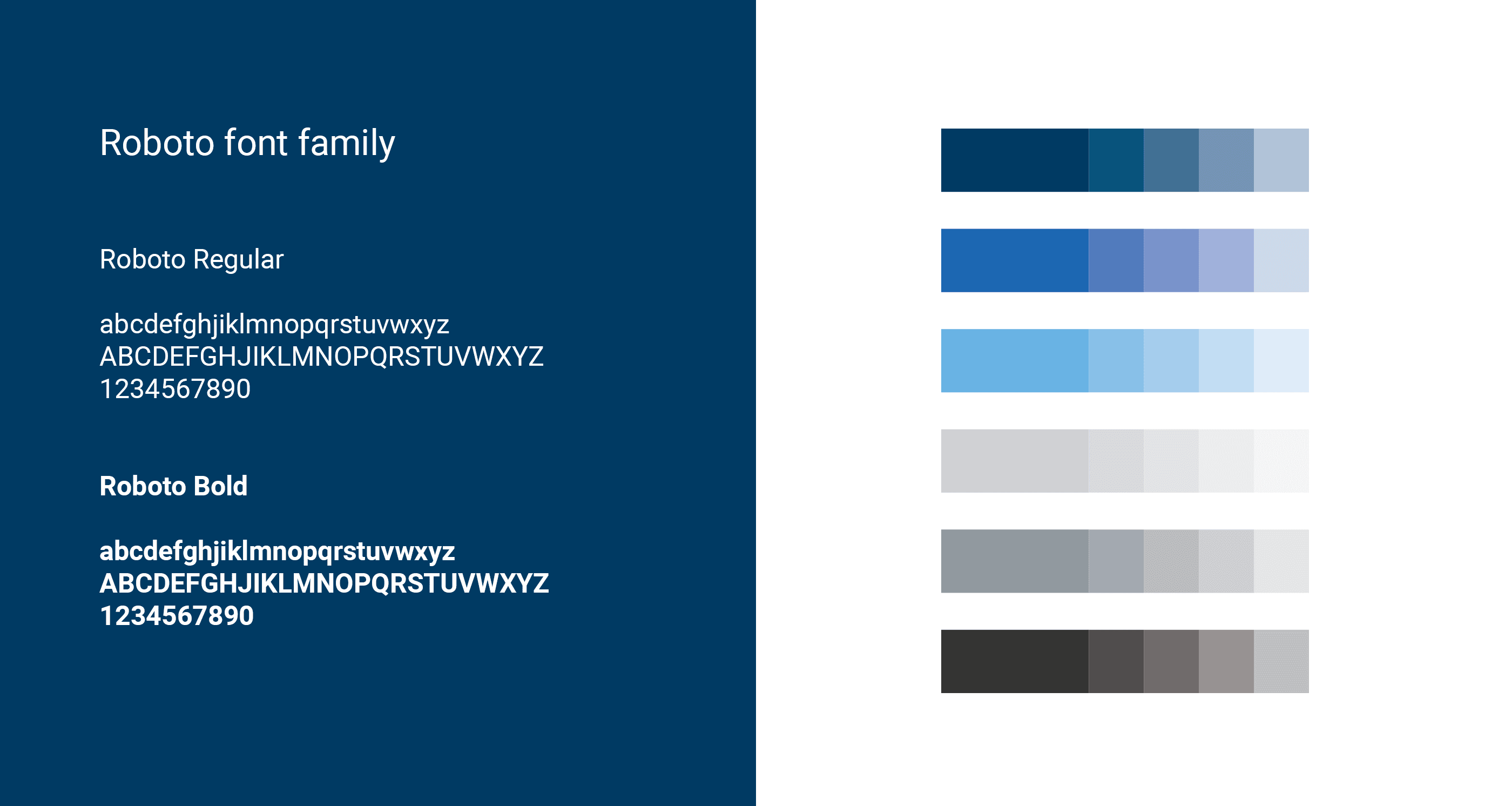
We defined a brand system that balances data and emotion, intellect and accessibility. The logo is clean and confident, anchored by a sharp payoff line and layered variations.
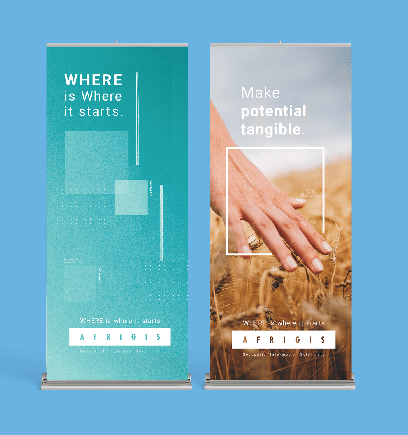
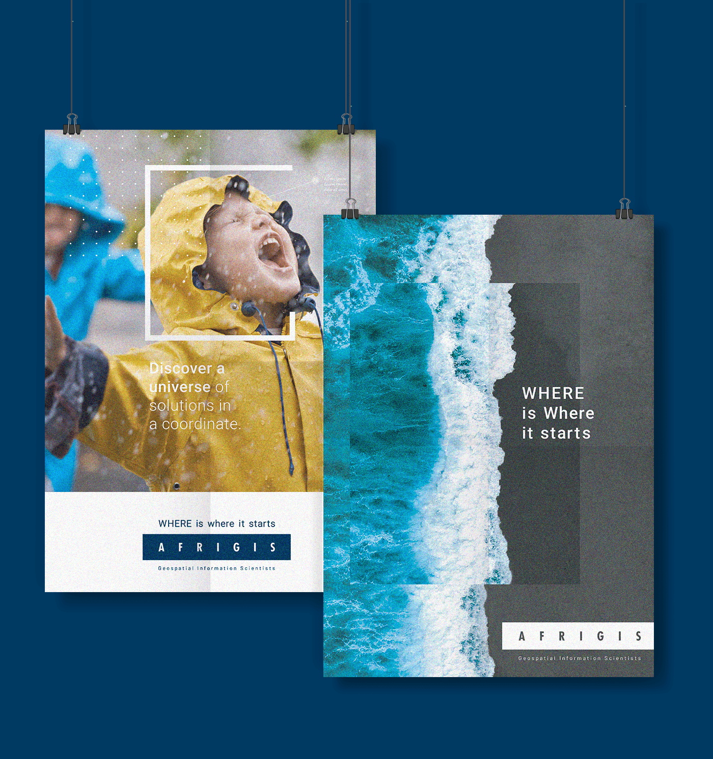
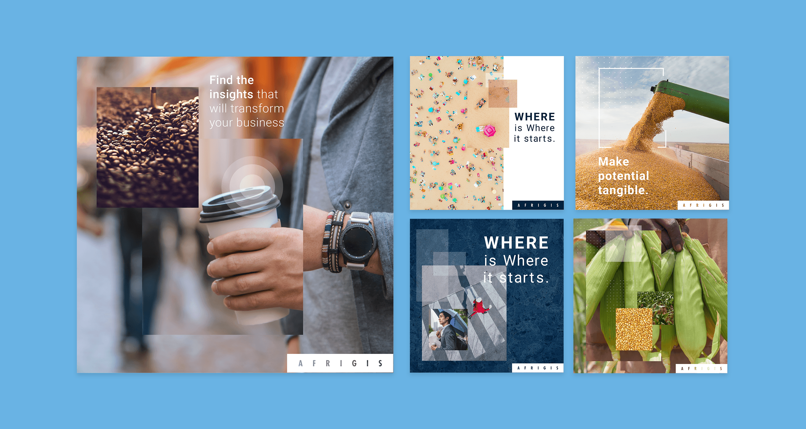
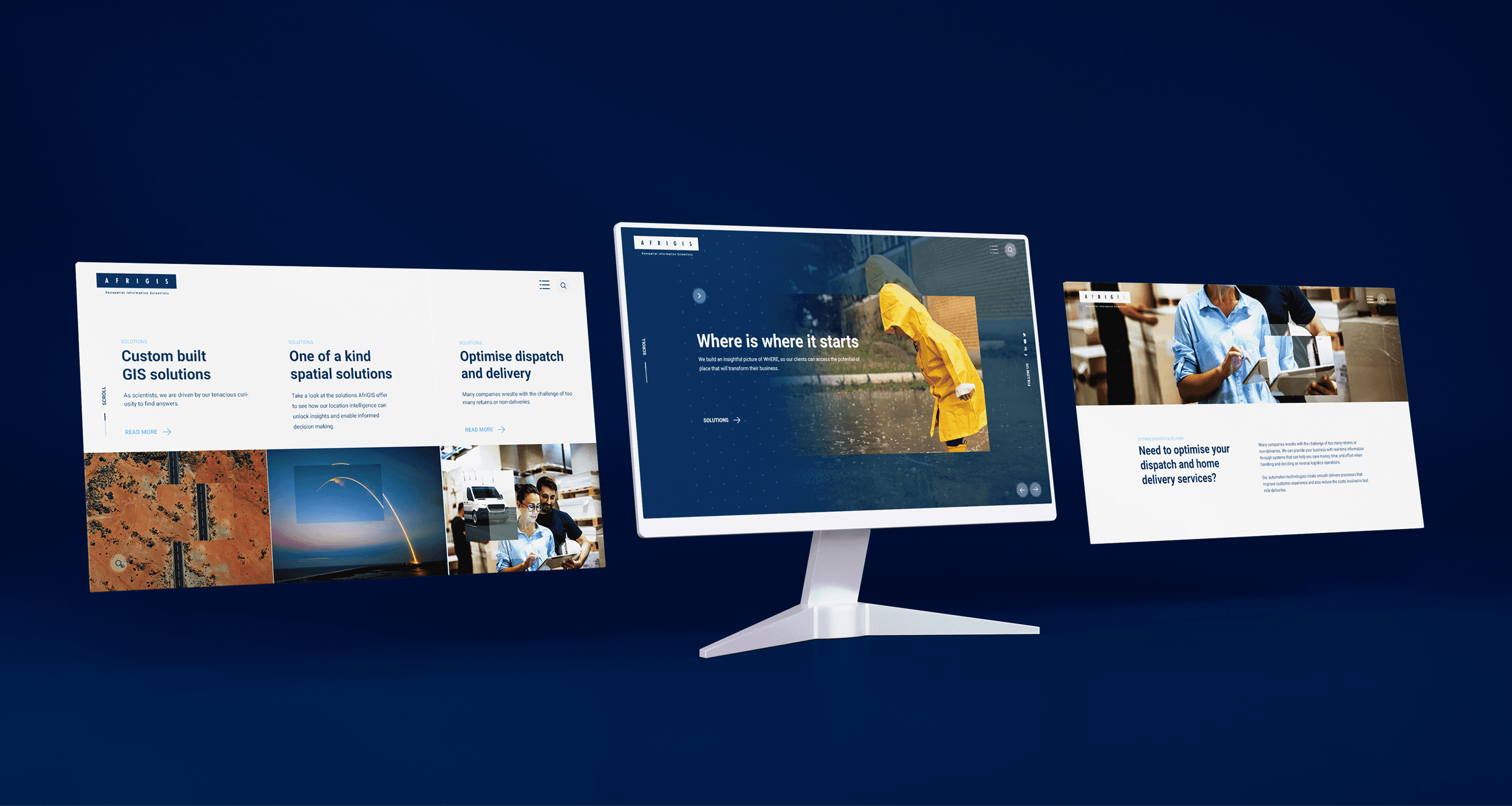
The color palette is grounded in deep navy with fresh accent tones, designed to feel trustworthy, precise, and energetic. Typography contrasts scientific serif with approachable sans-serif. The illustration system leans into line-based metaphors of “digging deeper” and “revealing insight,” while photography guidelines encourage juxtaposition and unexpected perspective. Together, these elements bring the brand’s tone, professional, ambitious, and empowering to life across web, print, product, and social. It’s a brand built for a team of tenacious scientists and the world they’re helping us see more clearly.
More Works

Afrigis Branding
A bold, intelligent brand rooted in curiosity, clarity, and the science of “where is where it starts.”
Brand Design
Website Design
Introduction
AfriGIS is a geospatial information company solving complex location-based challenges through data, design, and innovation. Our role was to distill that layered, scientific depth into a brand that feels focused, empowering, and undeniably human.
Where Is Where It Starts
Our role was to distill that layered, scientific depth into a brand that feels focused, empowering, and undeniably human. We rebuilt the identity from the ground up, including the tone of voice, design system, illustration style, and marketing touchpoints. Every element had to reflect their core truth: “WHERE is where it starts.”
Credits
Role: Senior Designer
Agency: Limbik
The Problem
Despite offering advanced solutions to some of the continent’s biggest data problems, AfriGIS’s existing identity lacked emotional clarity and consistency.
Their visual language was fragmented. Their voice felt technical and formal, not reflective of their creative, curious, people-driven approach to science and problem-solving.
The Solution
We defined a brand system that balances data and emotion, intellect and accessibility. The logo is clean and confident, anchored by a sharp payoff line and layered variations.
The color palette is grounded in deep navy with fresh accent tones, designed to feel trustworthy, precise, and energetic. Typography contrasts scientific serif with approachable sans-serif. The illustration system leans into line-based metaphors of “digging deeper” and “revealing insight,” while photography guidelines encourage juxtaposition and unexpected perspective. Together, these elements bring the brand’s tone, professional, ambitious, and empowering to life across web, print, product, and social. It’s a brand built for a team of tenacious scientists and the world they’re helping us see more clearly.
More Works