Sudonum Website Design
Repositioning a powerful telecom API platform through clarity, motion, and focused design.
Website Design
Visual Direction
Introduction
Sudonum is a real-time voice and messaging API company with global reach and deep technical roots.
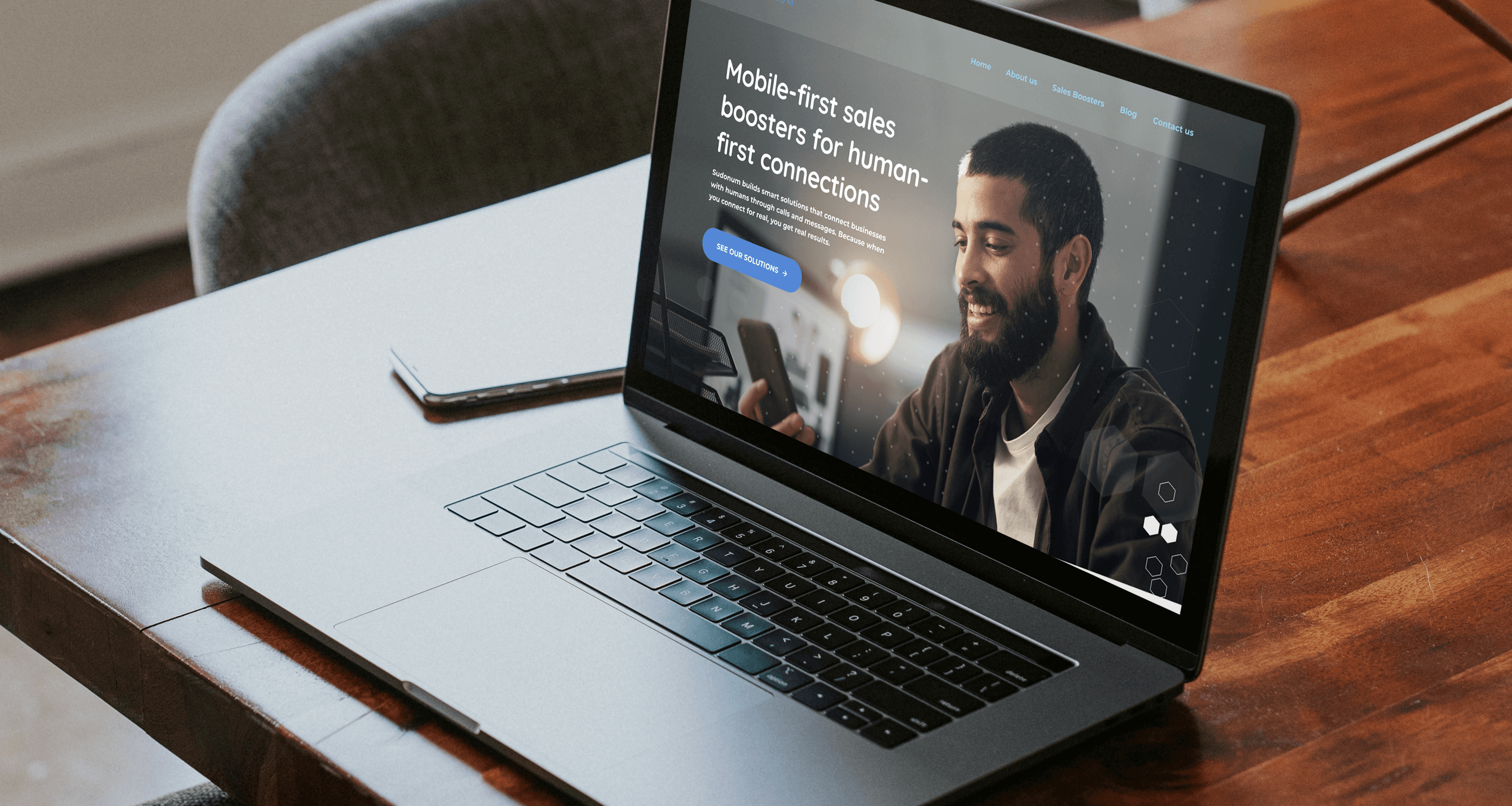
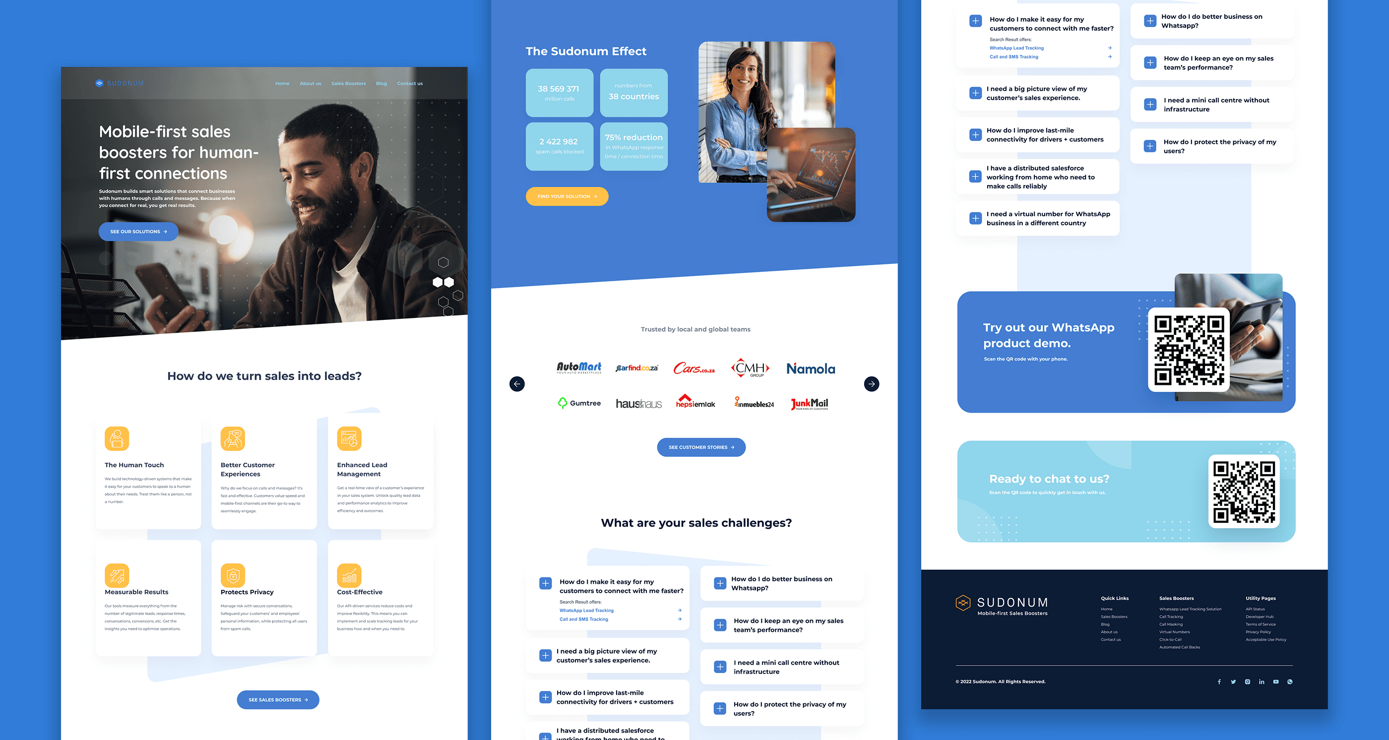
Mobile-first sales boosters for human-first connections
In collaboration with the creative team at Limbik, I led the redesign of the Sudonum website, focusing on clarity, trust, and visual rhythm. My role included site design, layout systems, and visual exploration to evolve how the brand communicates its value: secure, scalable tools for modern communication. The result is a web experience that feels light, direct, and tech-forward, a reflection of the product itself.
Credits
Role: Senior Designer
Agency: Limbik
The Problem
Sudonum’s old site was functional but lacked storytelling and design cohesion.
The product offering is complex, API-based, developer-first, and infrastructure-heavy; yet, the visual language didn’t support ease of understanding or inspire confidence. The brand needed a cleaner, more intuitive digital presence that could bridge the gap between technical depth and everyday clarity.

The Solution
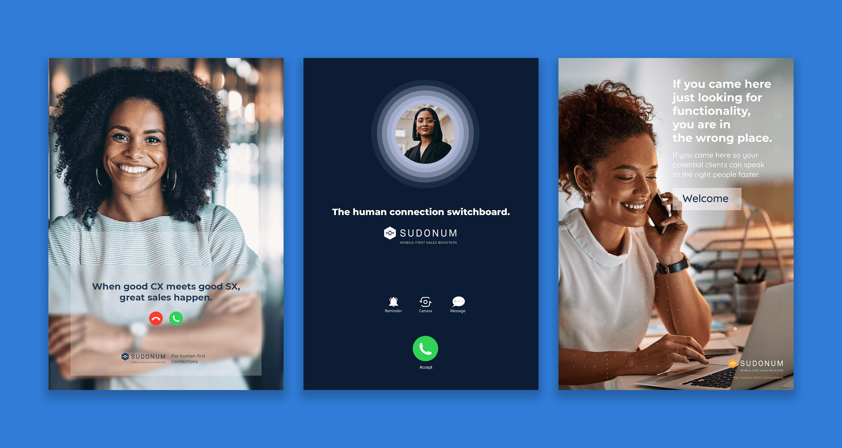
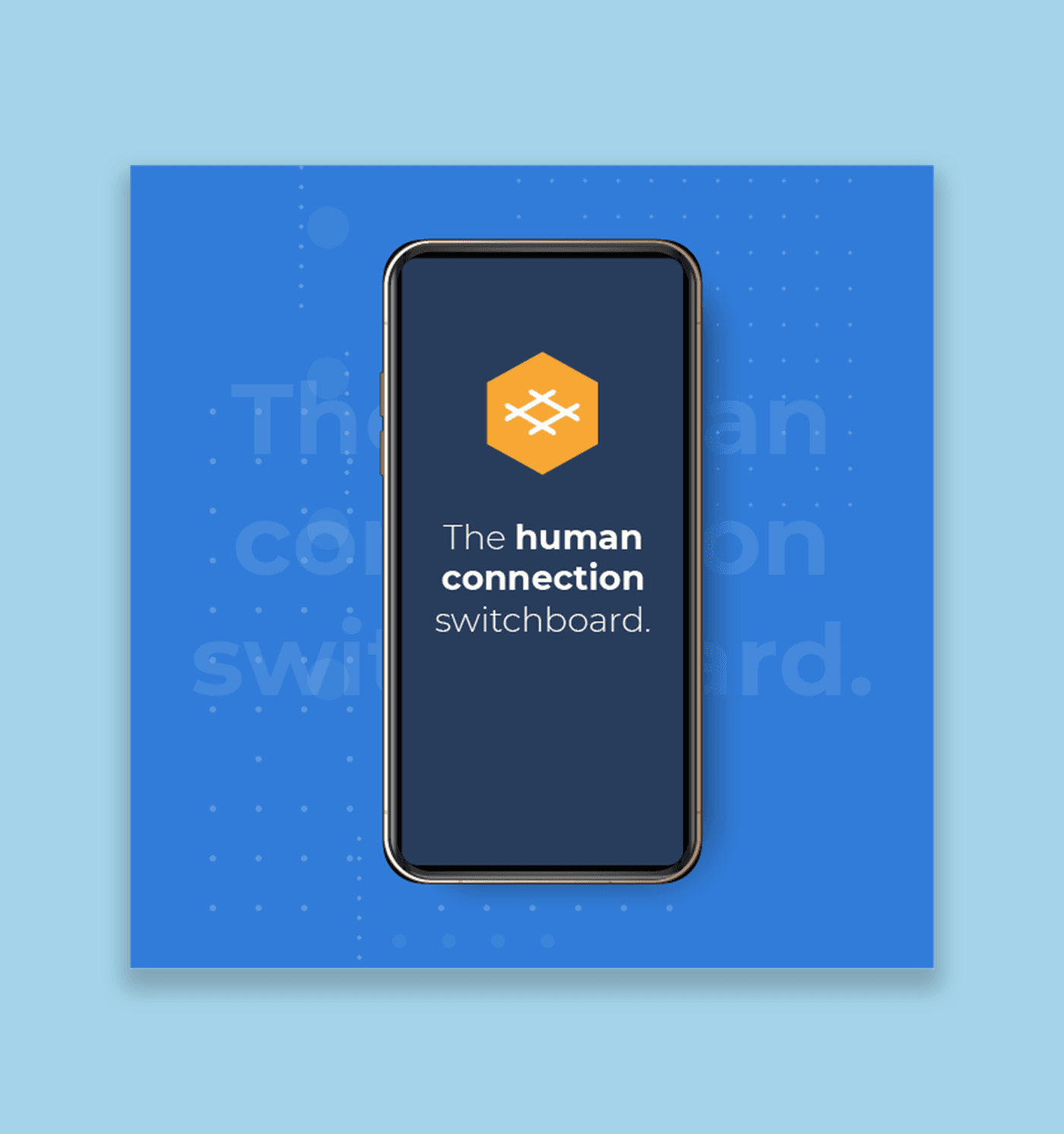
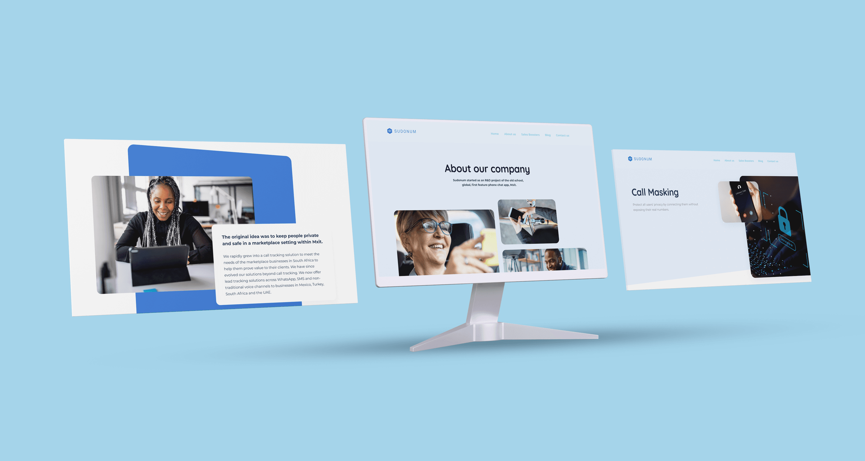
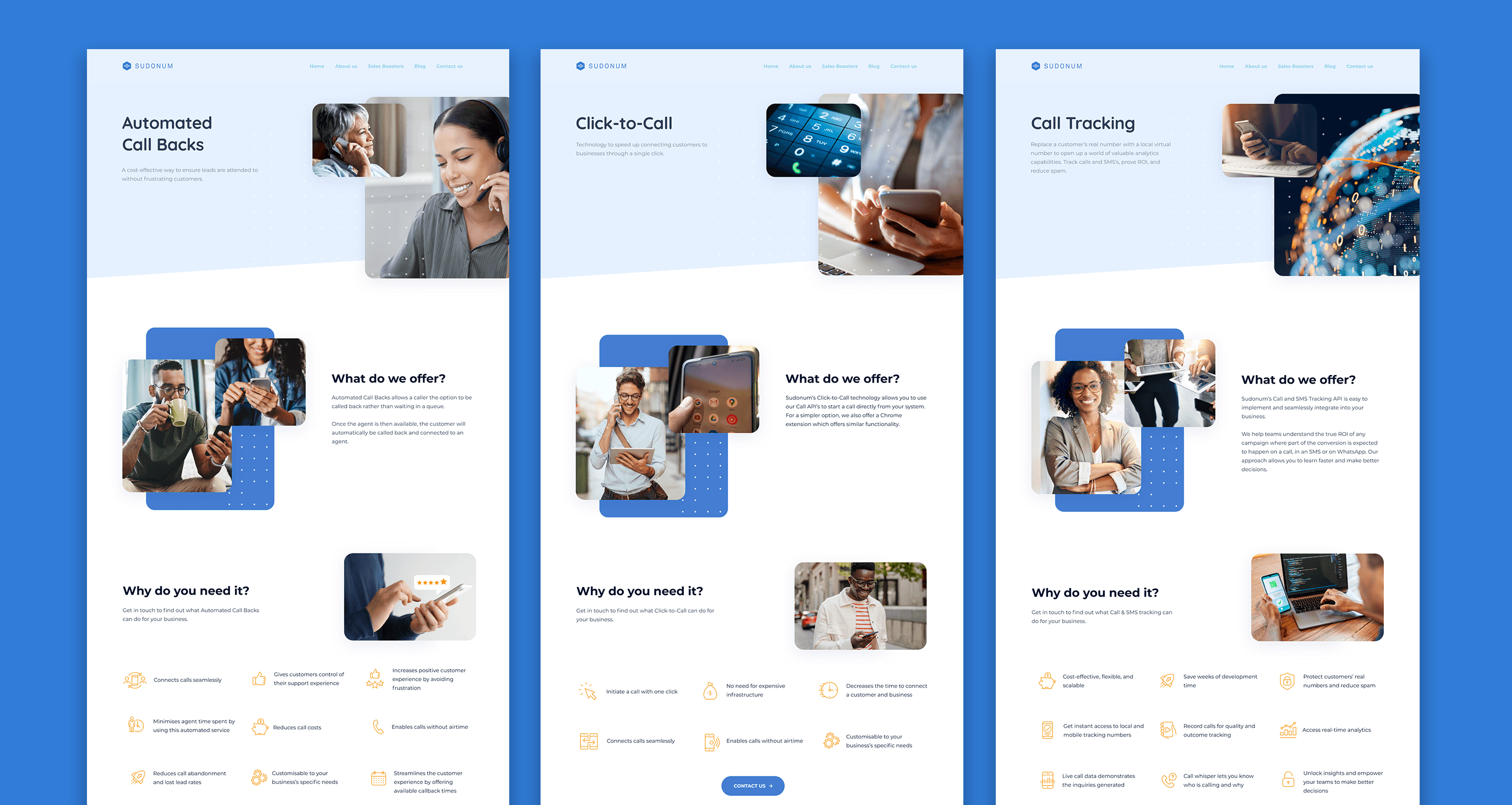
We stripped the interface back to its essentials, building clean layouts that highlight benefits first, supported by crisp UI visuals, ambient motion, and developer-friendly hierarchy.
I designed key templates and landing structures that could scale across product lines and use cases. A cool, grounded color palette and sharp sans-serif typography ensured readability across devices, while the introduction of subtle motion added a sense of dynamism and control. The design system now allows Sudonum to evolve visually while staying rooted in trust, precision, and future-readiness.
More Works

Sudonum Website Design
Repositioning a powerful telecom API platform through clarity, motion, and focused design.
Website Design
Visual Direction
Introduction
Sudonum is a real-time voice and messaging API company with global reach and deep technical roots.
Mobile-first sales boosters for human-first connections
In collaboration with the creative team at Limbik, I led the redesign of the Sudonum website, focusing on clarity, trust, and visual rhythm. My role included site design, layout systems, and visual exploration to evolve how the brand communicates its value: secure, scalable tools for modern communication. The result is a web experience that feels light, direct, and tech-forward, a reflection of the product itself.
Credits
Role: Senior Designer
Agency: Limbik
The Problem
Sudonum’s old site was functional but lacked storytelling and design cohesion.
The product offering is complex, API-based, developer-first, and infrastructure-heavy; yet, the visual language didn’t support ease of understanding or inspire confidence. The brand needed a cleaner, more intuitive digital presence that could bridge the gap between technical depth and everyday clarity.
The Solution
We stripped the interface back to its essentials, building clean layouts that highlight benefits first, supported by crisp UI visuals, ambient motion, and developer-friendly hierarchy.
I designed key templates and landing structures that could scale across product lines and use cases. A cool, grounded color palette and sharp sans-serif typography ensured readability across devices, while the introduction of subtle motion added a sense of dynamism and control. The design system now allows Sudonum to evolve visually while staying rooted in trust, precision, and future-readiness.
More Works