Element14 Branding Design
Designing a modern, modular identity for a tech partner that simplifies complexity.
Creative Direction
Branding
Introduction
Element14 (or “e14”) is a specialist IT solutions provider that helps mid-sized businesses navigate complex technology challenges.
E14
Their strength lies in providing deeply personalized service, fostering long-term partnerships, and delivering end-to-end IT strategy. The brand identity needed to reflect all of that, with clarity, professionalism, and a spark of originality. The resulting system is clean, future-leaning, and flexible, built around a bold typographic wordmark, a modular “14” logomark, and a crisp color palette designed to evoke a sense of both technical precision and humanity.
Credits
Role: Creative Director
Client: Element14
The Problem
Element14’s previous branding felt underpowered and disconnected from the value it delivered, strategic, hands-on, relationship-first IT consulting.
They needed a brand system that would stand out in a sea of generic tech visuals, but still feel trustworthy, expert, and relevant to B2B audiences. Importantly, it also had to scale across digital, print, and physical applications with minimal friction.
The Solution
We crafted a full identity system rooted in the brand's core proposition: Simplify Complexity.
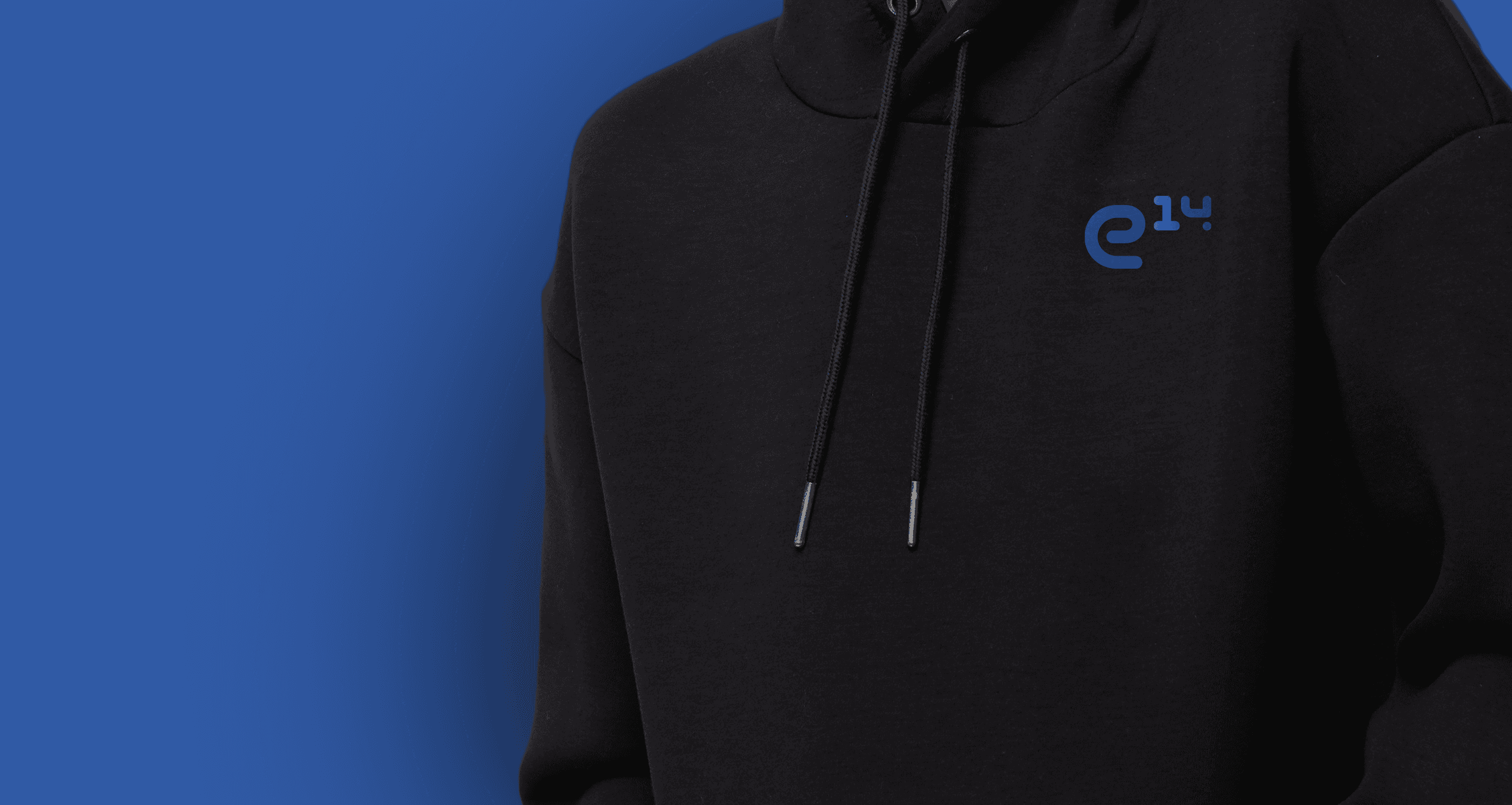
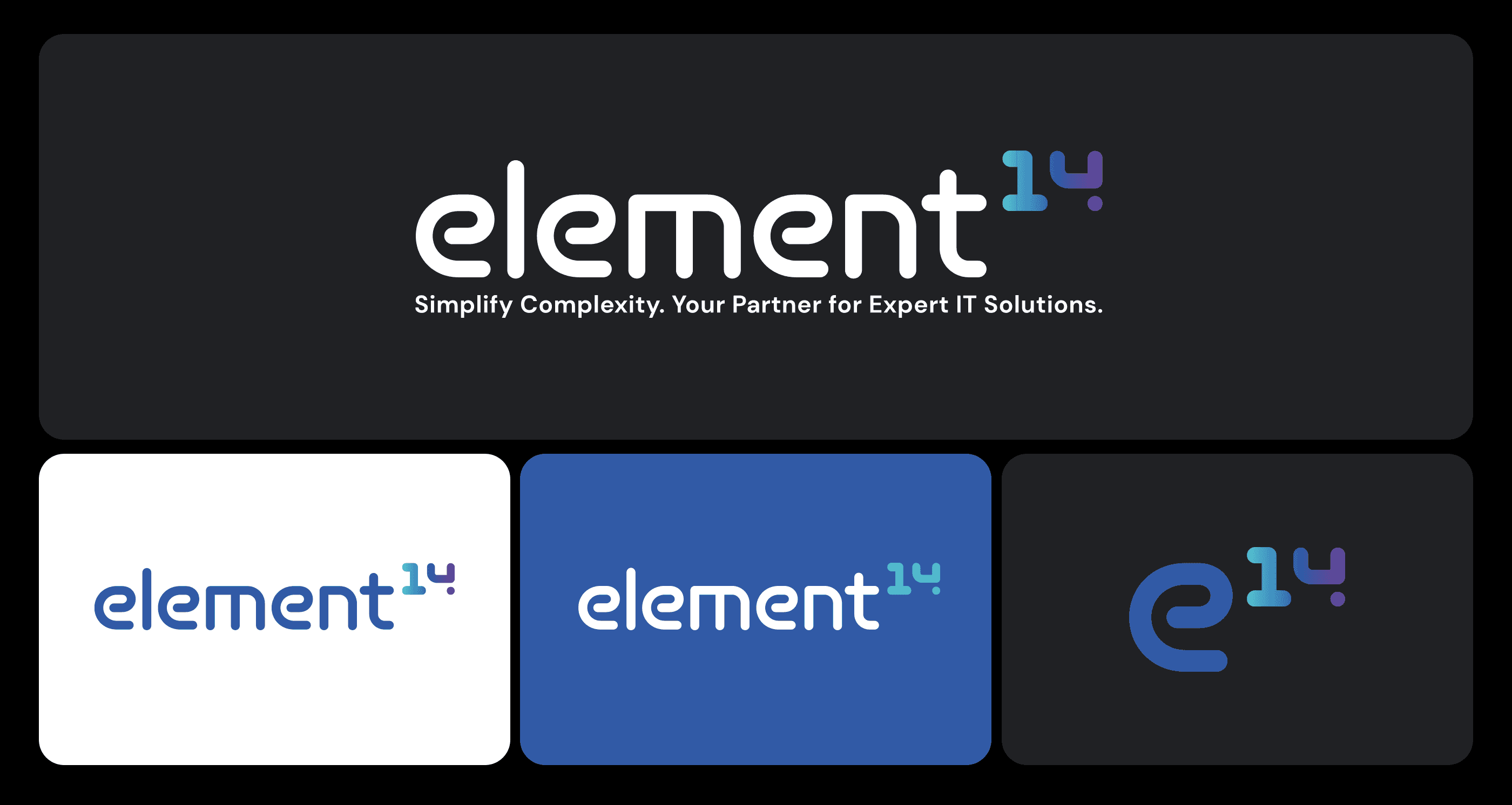
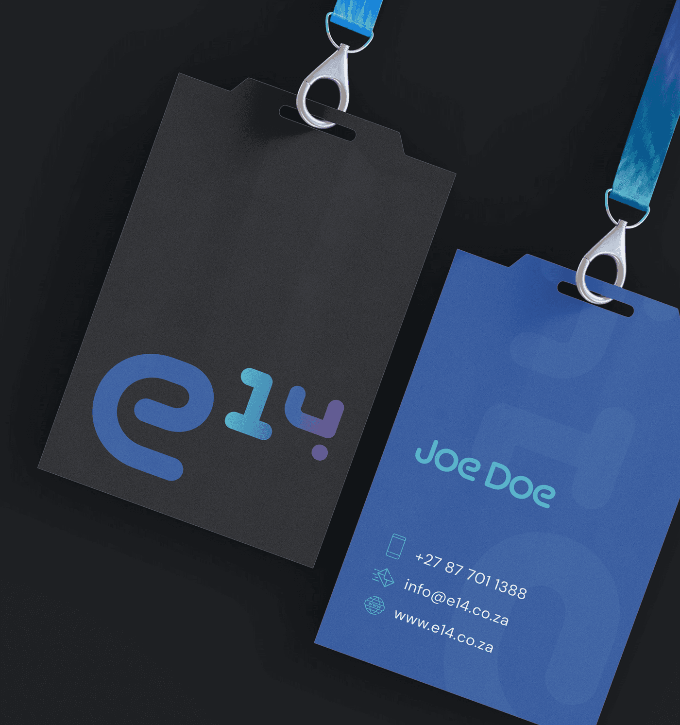
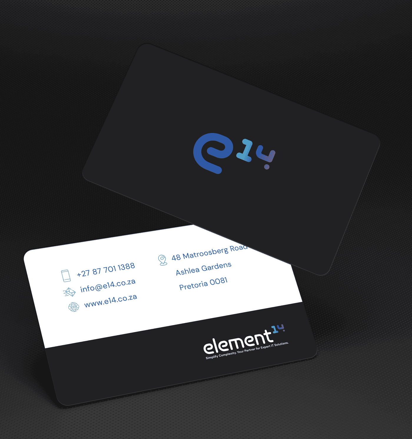
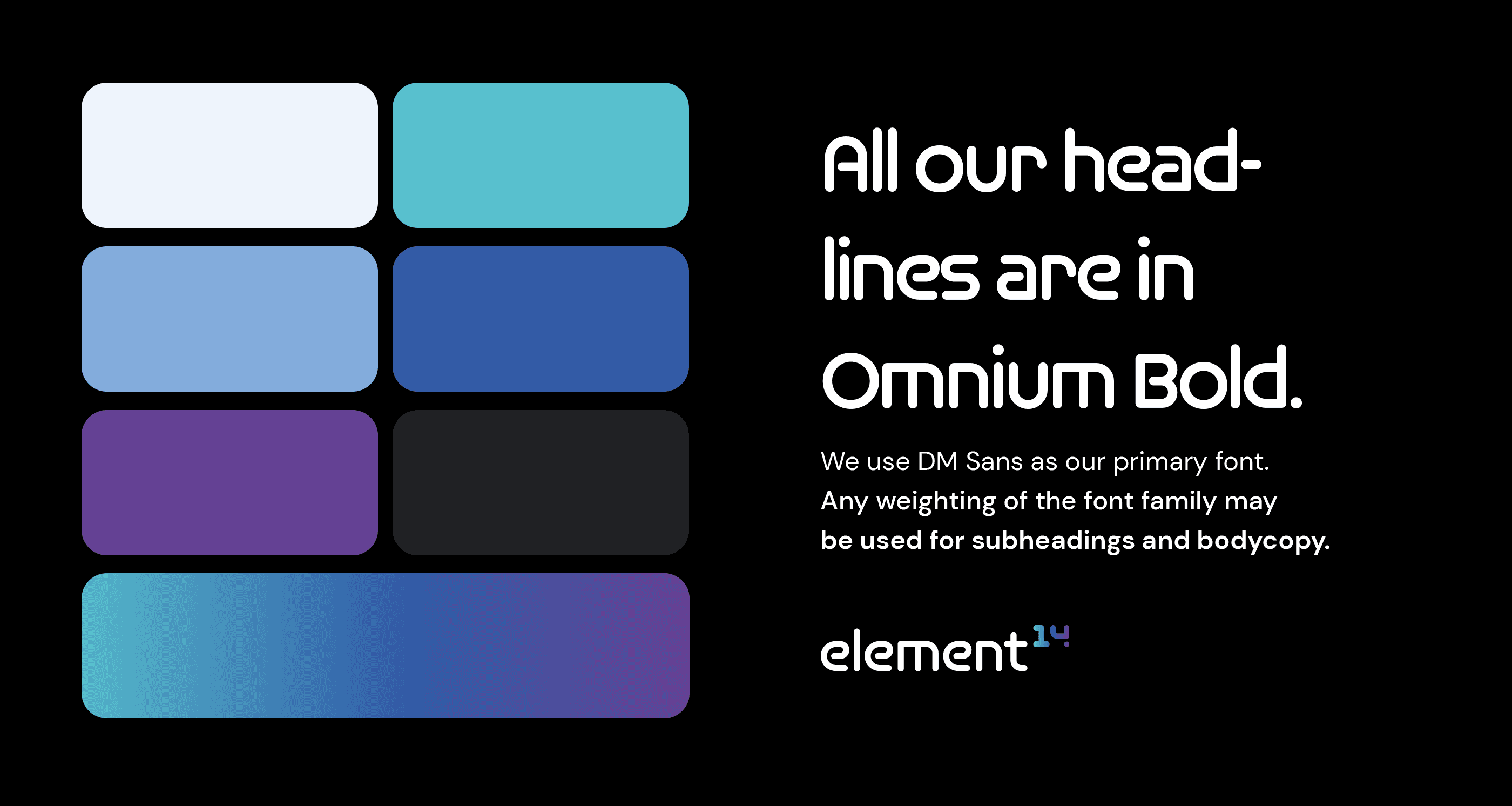
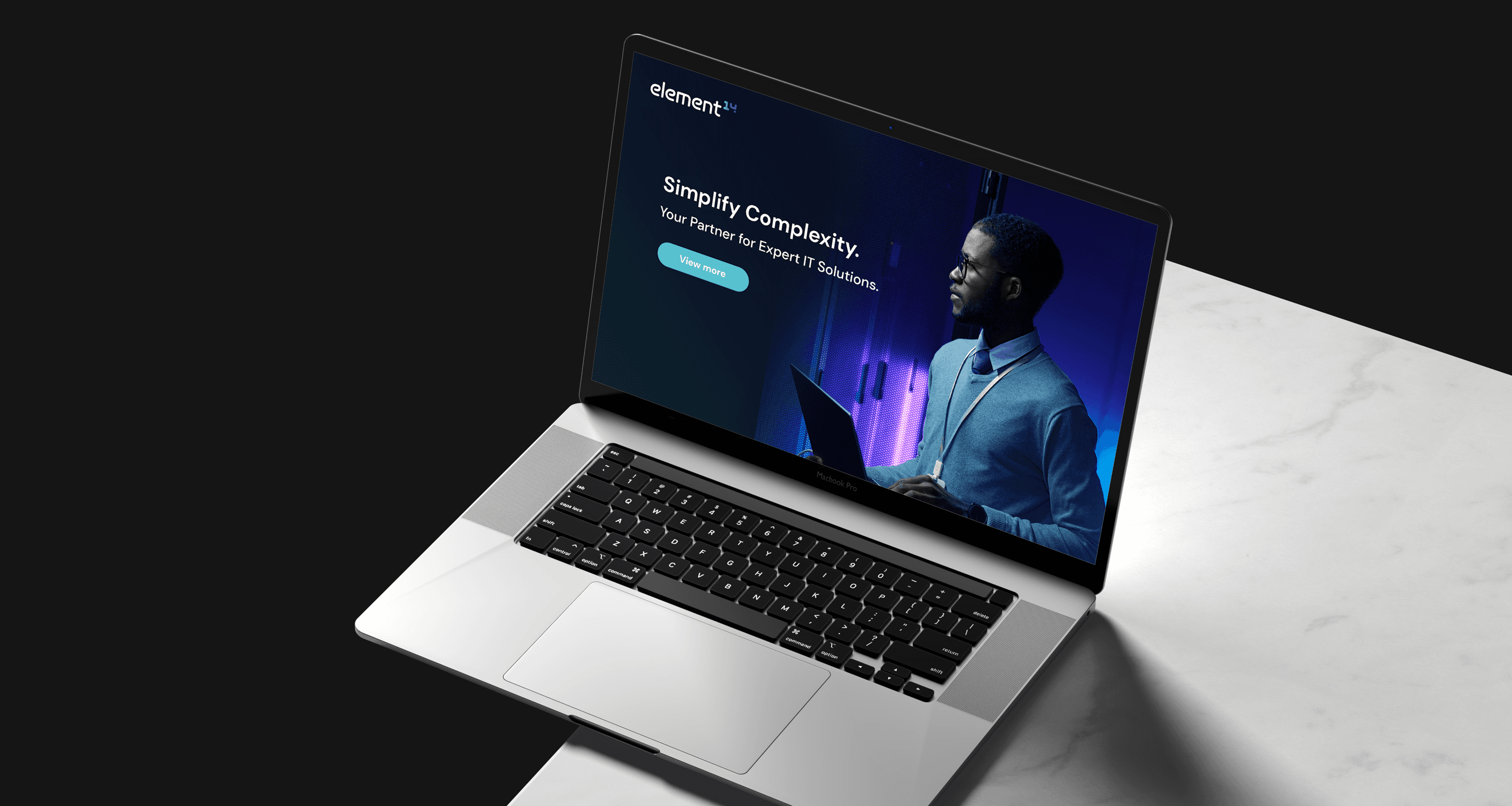
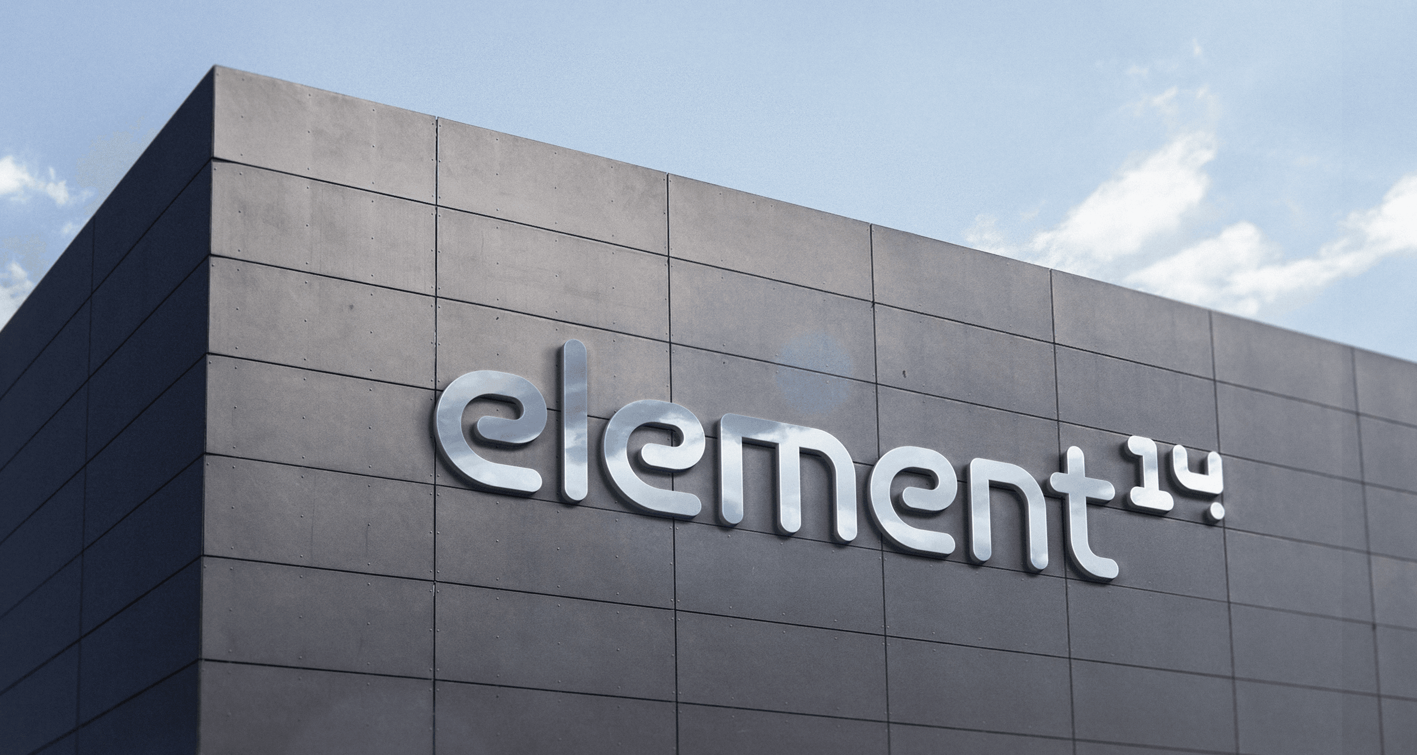
The logo uses rounded, geometric type for warmth and approachability, while the stylized “14” adds a distinct visual signature, inspired by the periodic table’s silicon, the element powering innovation. A deep blue-to-purple gradient system supports the brand’s narrative of bridging hard technology and soft connection. The type system (Omnium Bold + DM Sans) reinforces clarity and usability. The result: a sleek, adaptable brand that feels just as at home on a hoodie or a server cabinet.
More Works

Element14 Branding Design
Designing a modern, modular identity for a tech partner that simplifies complexity.
Creative Direction
Branding
Introduction
Element14 (or “e14”) is a specialist IT solutions provider that helps mid-sized businesses navigate complex technology challenges.
E14
Their strength lies in providing deeply personalized service, fostering long-term partnerships, and delivering end-to-end IT strategy. The brand identity needed to reflect all of that, with clarity, professionalism, and a spark of originality. The resulting system is clean, future-leaning, and flexible, built around a bold typographic wordmark, a modular “14” logomark, and a crisp color palette designed to evoke a sense of both technical precision and humanity.
Credits
Role: Creative Director
Client: Element14
The Problem
Element14’s previous branding felt underpowered and disconnected from the value it delivered, strategic, hands-on, relationship-first IT consulting.
They needed a brand system that would stand out in a sea of generic tech visuals, but still feel trustworthy, expert, and relevant to B2B audiences. Importantly, it also had to scale across digital, print, and physical applications with minimal friction.
The Solution
We crafted a full identity system rooted in the brand's core proposition: Simplify Complexity.
The logo uses rounded, geometric type for warmth and approachability, while the stylized “14” adds a distinct visual signature, inspired by the periodic table’s silicon, the element powering innovation. A deep blue-to-purple gradient system supports the brand’s narrative of bridging hard technology and soft connection. The type system (Omnium Bold + DM Sans) reinforces clarity and usability. The result: a sleek, adaptable brand that feels just as at home on a hoodie or a server cabinet.
More Works